Kathleen Ross - Personal Branding
Brand development and design
➤ CHALLENGE | Kathleen’s brand was all over the place. Her LinkedIn looked polished, but her AI presentations felt dark and overly "techy," leaving her without a clear identity. Because she was trying to be a "blank canvas" for everyone, her high-energy personality got lost, making it hard to land the big speaking gigs she really wanted.
➤ STRATEGY
& SOLUTION | We moved away from the generic corporate look to create a brand driven by Kathleen’s actual personality. We built a consistent master brand that works across all platforms, using a new brand guide and set layouts to blend her creative energy with a professional edge. This shift aligned her image with top-tier leaders like Mel Robbins, focusing on a signature look that feels both expert and approachable. RESULTS + IMPACT The new look turned a confusing digital presence into a bold, expert platform. With a cohesive brand finally in place, Kathleen is now positioned as a top-tier authority ready for elite partnerships. By showing up authentically, she has built the professional foundation needed to attract much larger stages and higher-profile clients.
You may also like
Natura - Rooted in Beauty USA Launch
Art Direction and Image Rendering
2024
MONAT GEAR - Reunion Las Vegas
Art Direction and Design
2022
Virgin Voyages Magzine Ads
2022
Miami Tank Girl
2017
Savane Branding
Lead Designer
2018
Guy Harvey Trim Pakage
Lead Designer
2018
PGA Tour - Cool Now Campaign
Digital Marketing
2018
MONAT GEAR - Women's Collection Campaign
Art Direction and Design
2022
Ms Bee Womxn Beauty
Brand Strategy | Package Design | Marketing
2022
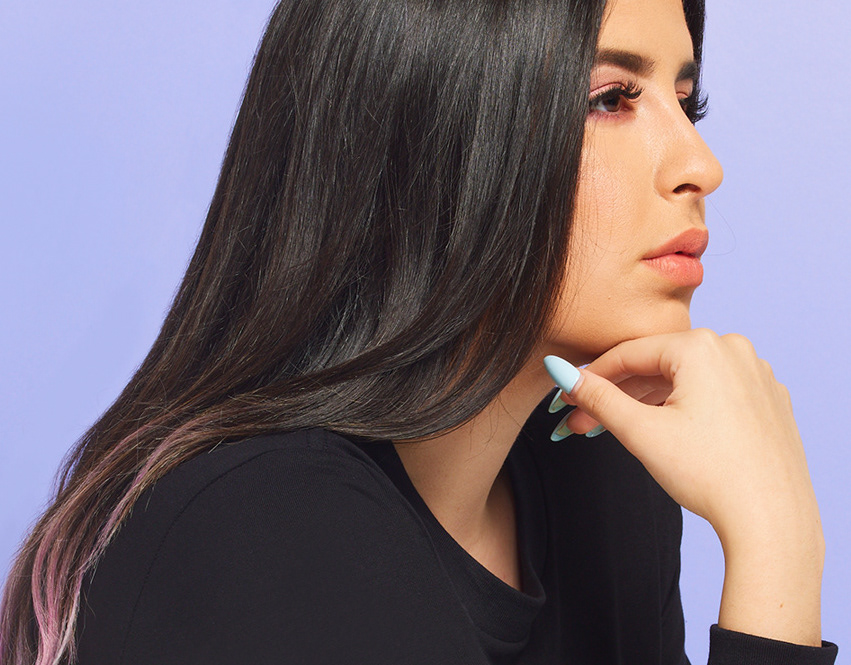
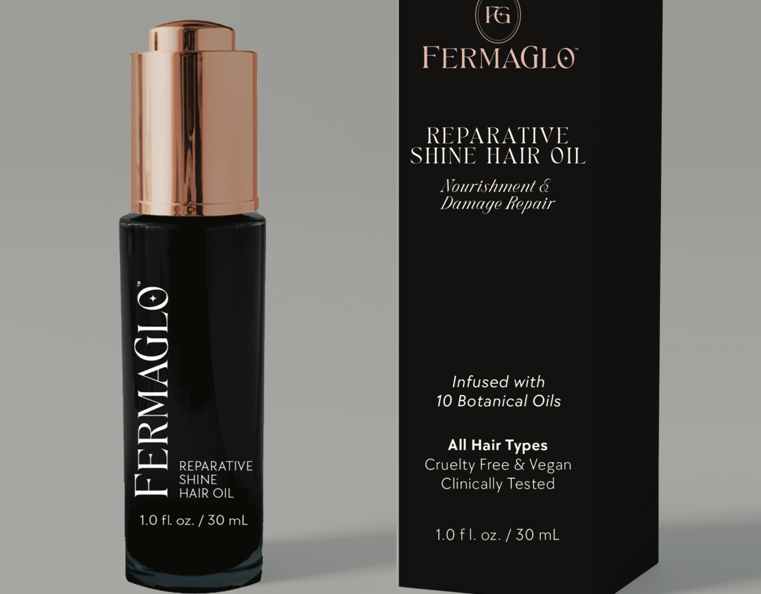
Fermaglo™ Package Design
Luxury Beauty Package Design
2025
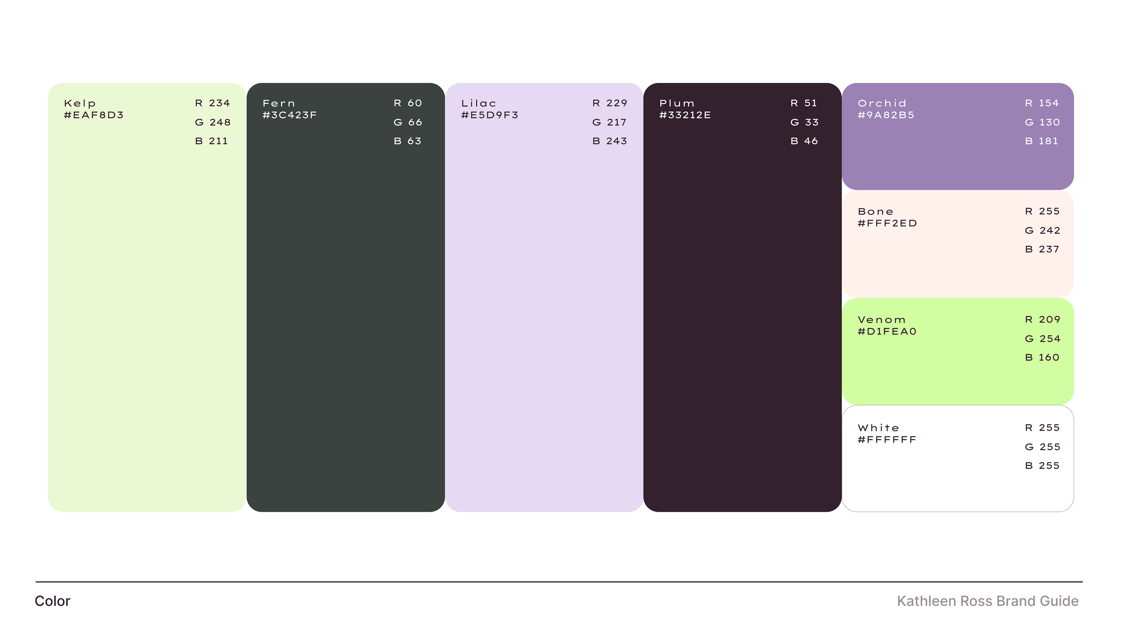
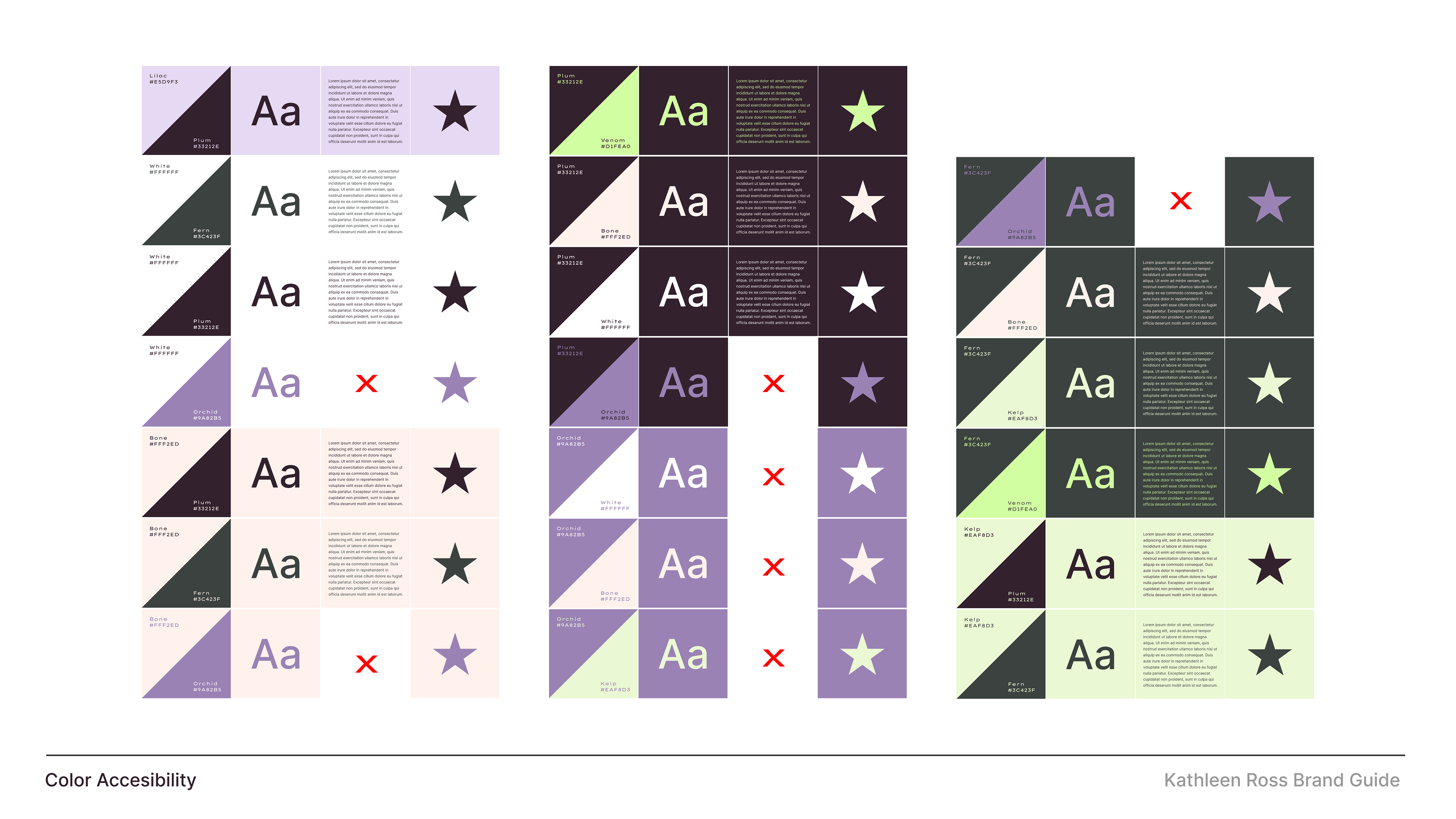
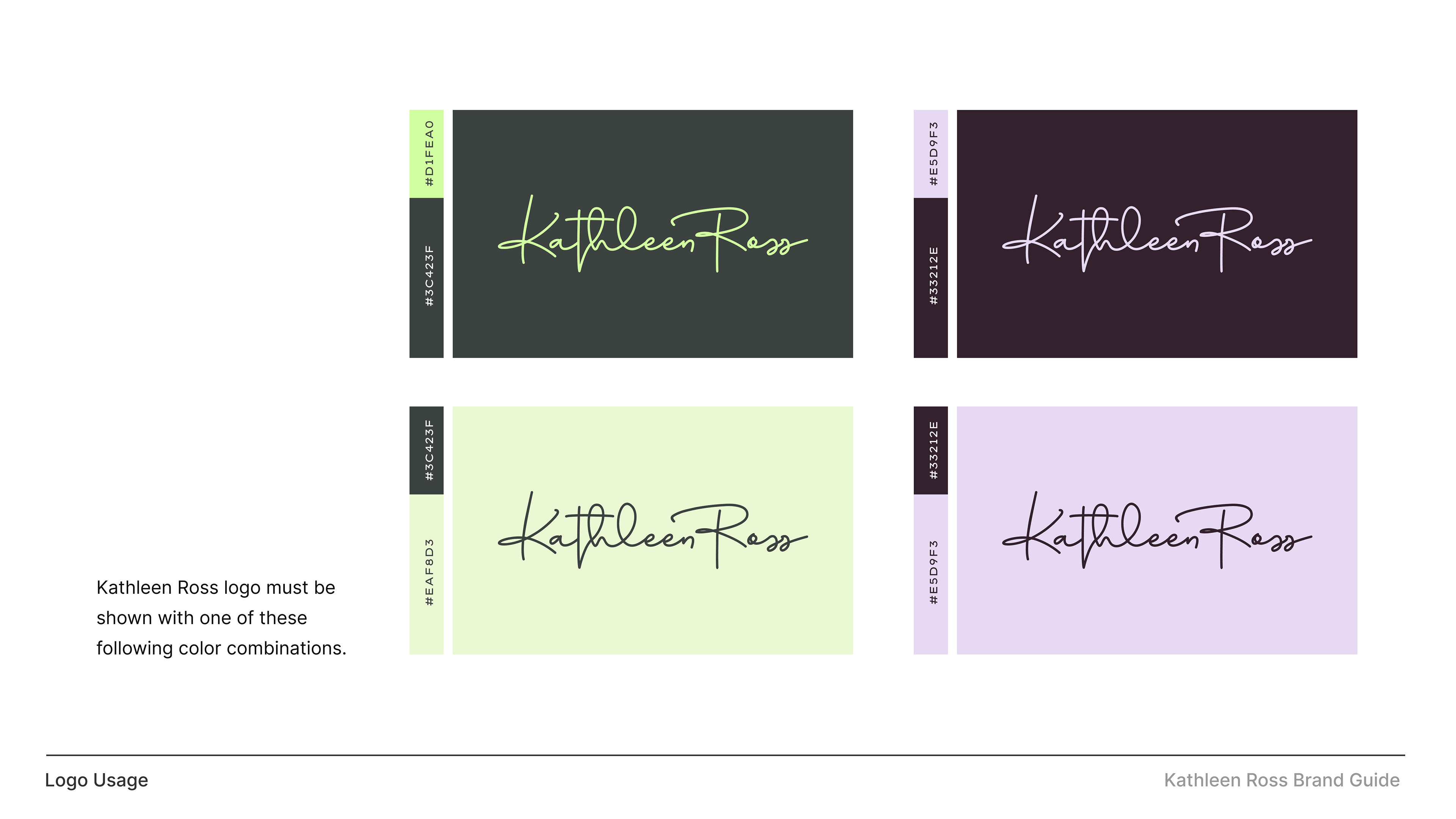
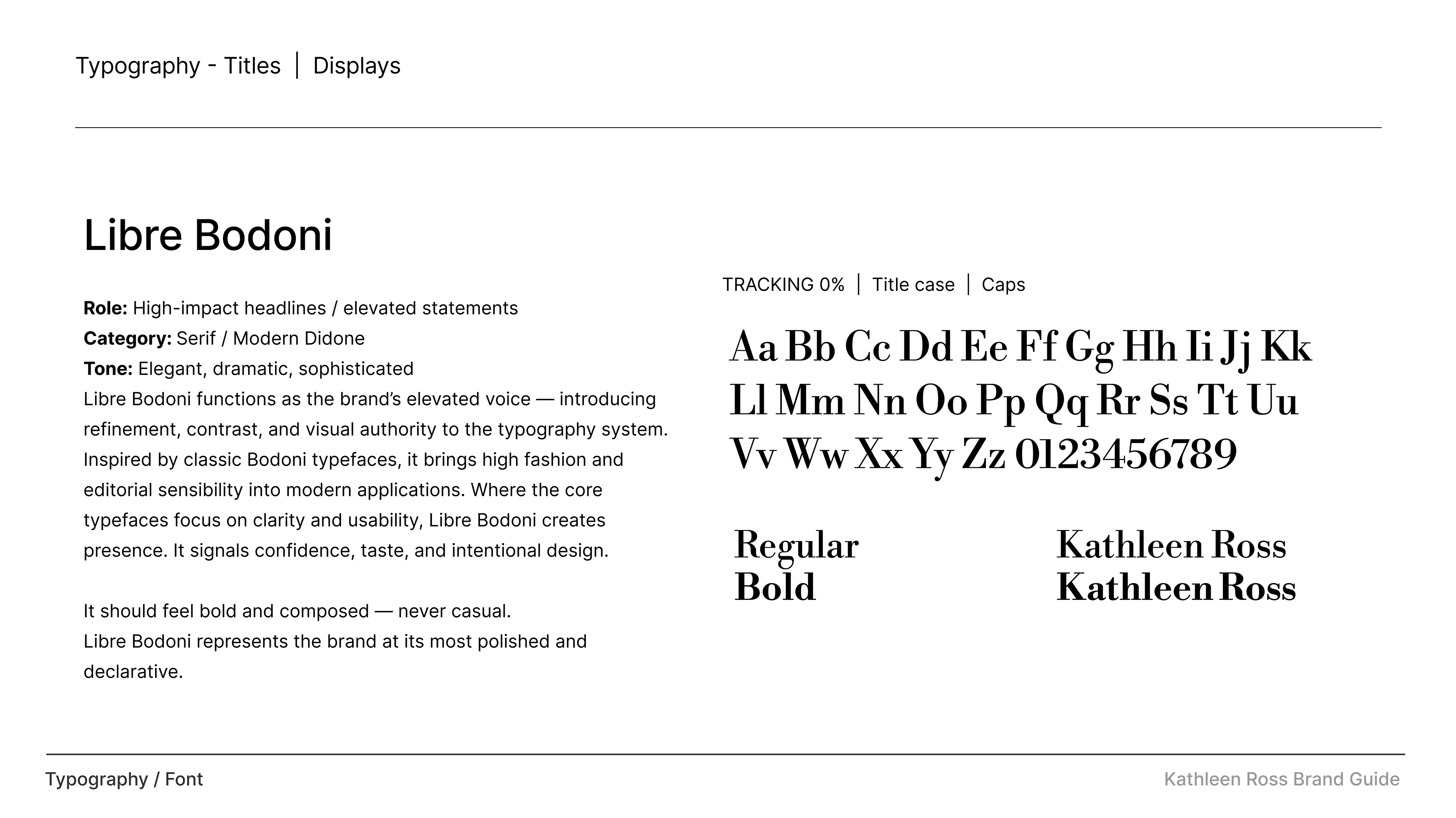
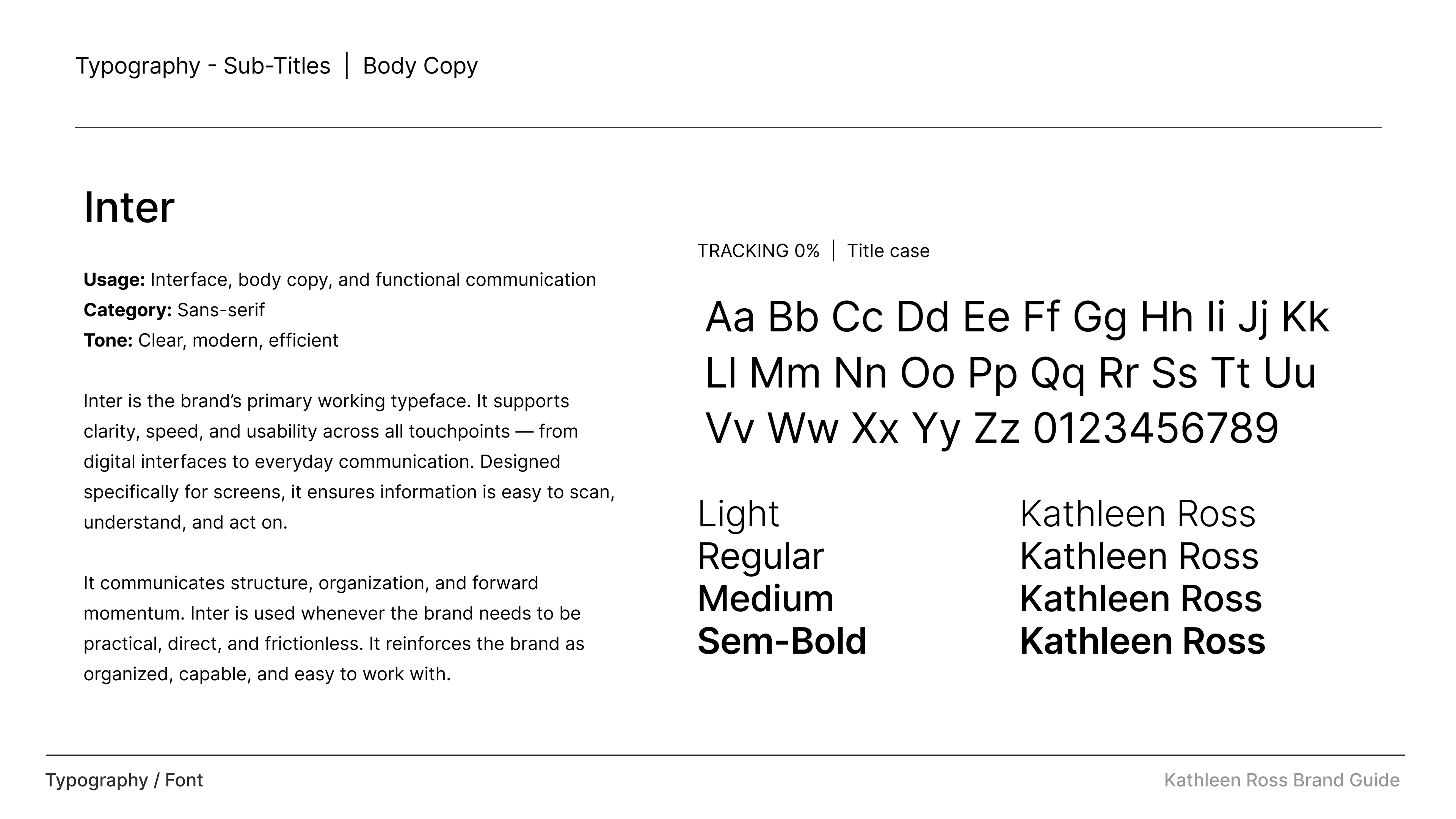
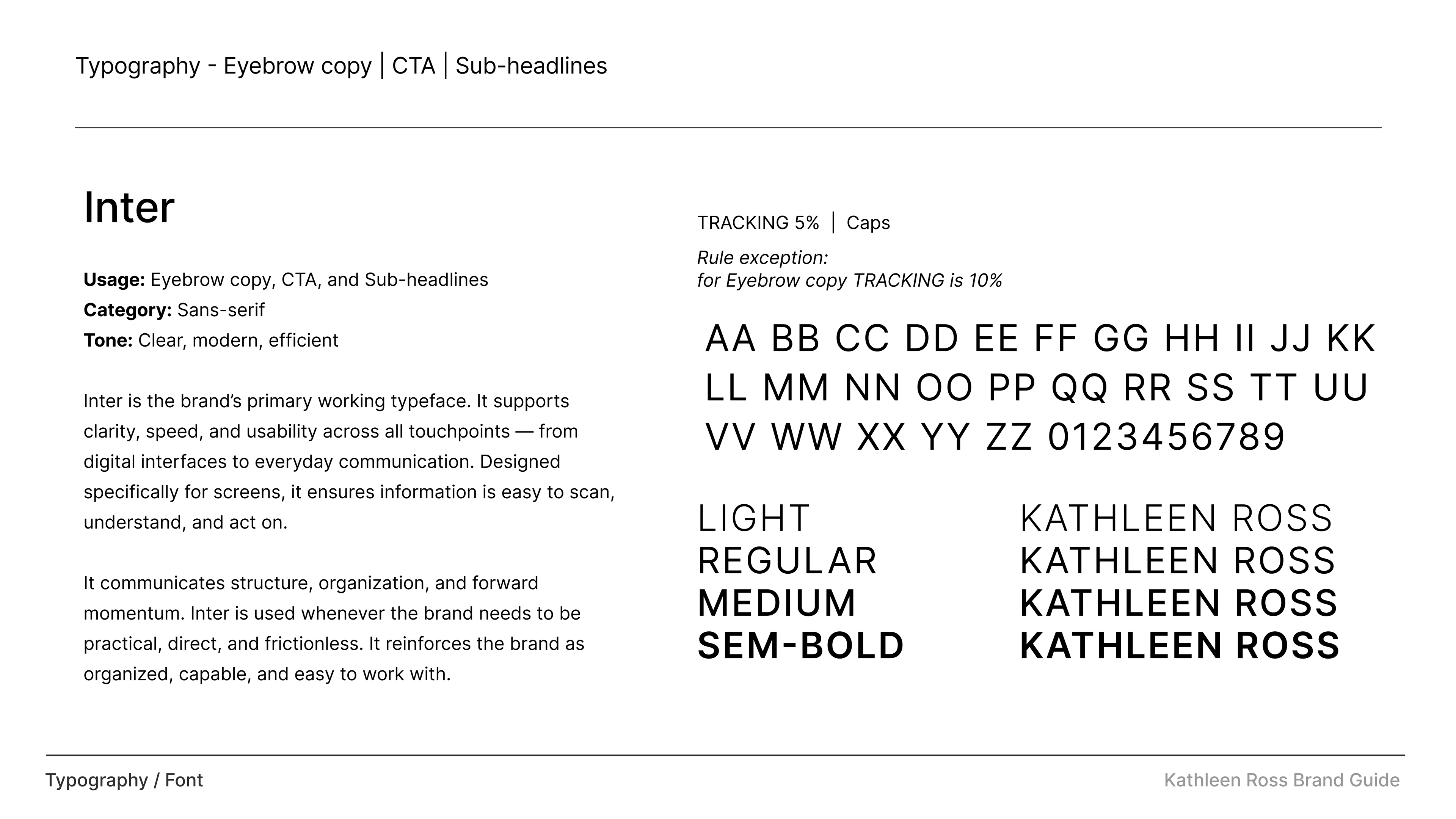
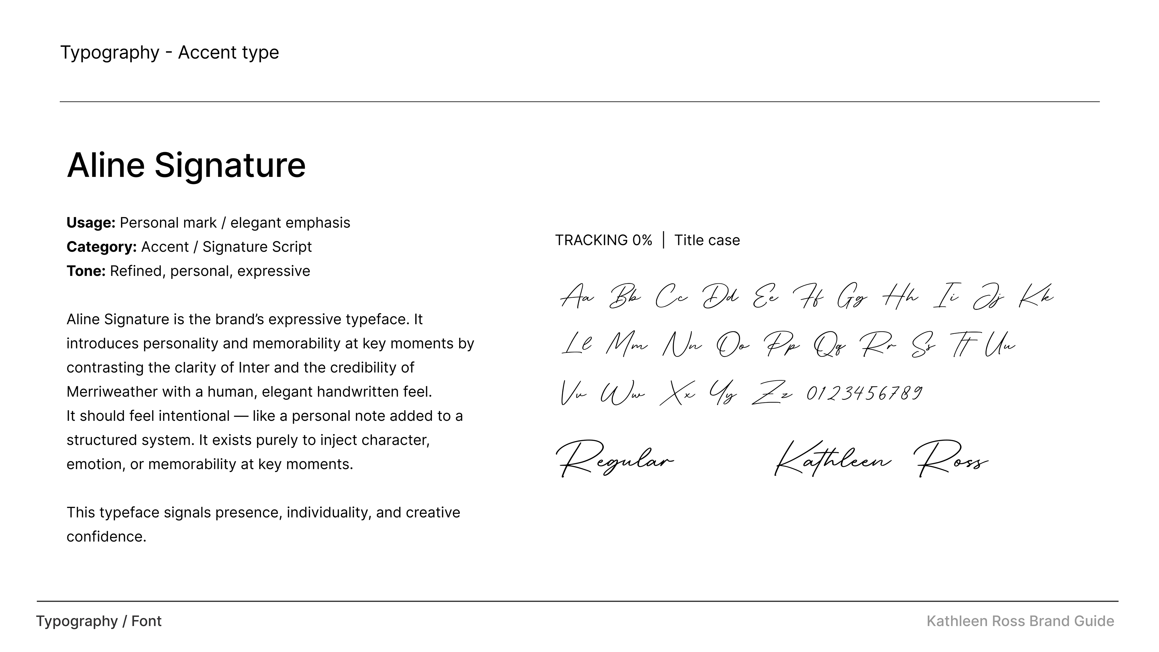
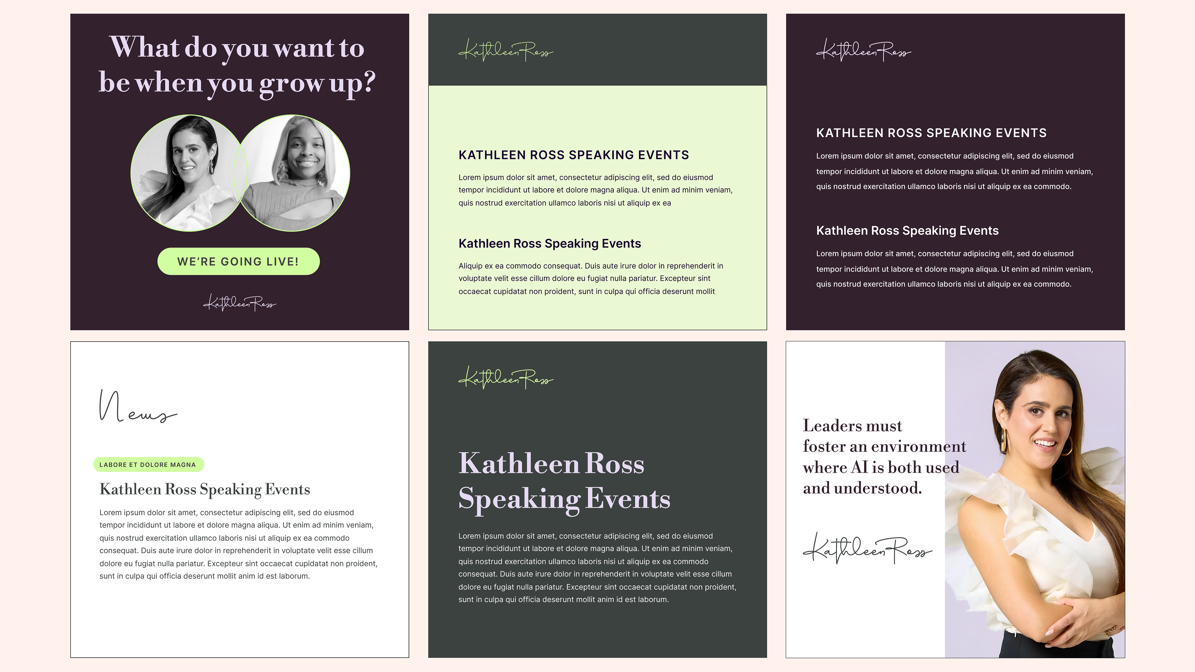
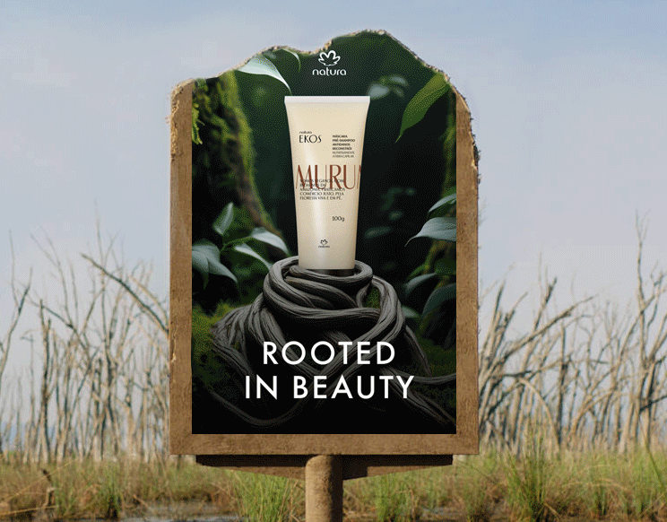
➤ CHALLENGE | The objective was to design a new suite of beauty product packaging that aligned with the existing brand system while elevating its perceived value. The brand had clear guidelines that needed to be followed, but the current packaging lacked a strong sense of luxury and differentiation. The challenge was balancing consistency with creative elevation. It required refining the brand without breaking it.
➤ STRATEGY & SOLUTION | We used the existing brand system as a foundation, elevating it through cleaner layouts, stronger hierarchy, and intentional use of space. The approach focused on restraint—letting typography, color, and structure create a more premium feel. Subtle refinements in finishes and composition helped enhance the perception of luxury. Each product was designed as part of a cohesive system while still feeling distinct. The result was a more elevated, scalable packaging architecture. OUTCOME | The final designs elevated the brand’s visual presence while maintaining consistency. The packaging felt more premium, modern, and competitive within the category. It created a scalable system for future product expansion. Overall, it strengthened both brand perception and shelf impact.